Project
PREFERE MINI CUP ICECREAM
Client
PREFERE
Service
Package, Graphic
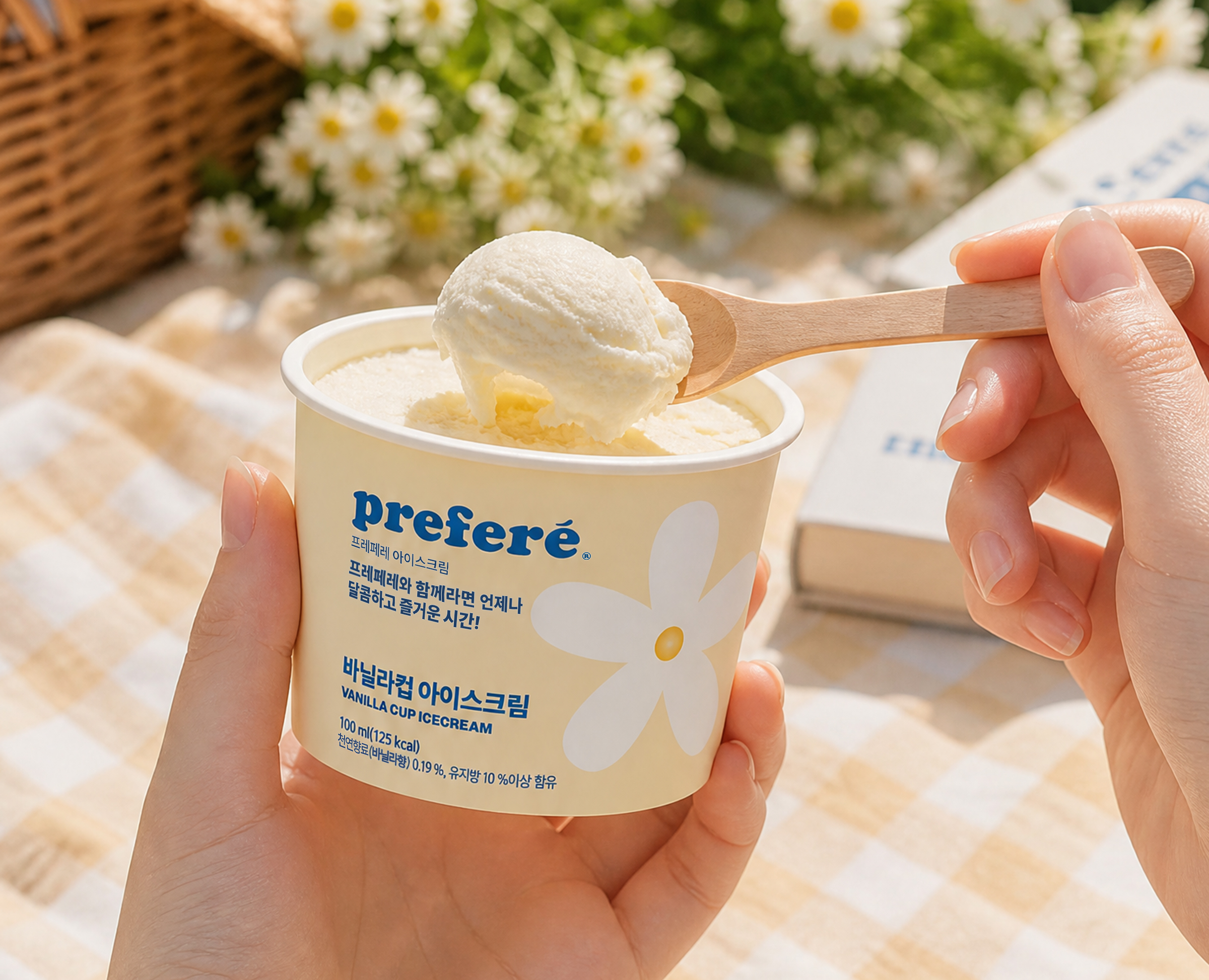
바닐라, 딸기, 초코의 특징을 단순하고 귀여운 일러스트와 컬러로 표현한 어린이 아이스크림 패키지입니다. 프레페레 워드마크와 맛 이름을 중심으로 정보 위계를 명확하게 구성해 브랜드와 제품 종류를 직관적으로 인식할 수 있도록 했습니다. 플랫한 그래픽과 충분한 여백을 활용해 밝고 친근한 분위기를 유지하면서도, 세 가지 제품이 하나의 시리즈로 자연스럽게 연결되도록 디자인했습니다.
This children’s ice cream packaging expresses vanilla, strawberry, and chocolate through simple, playful illustrations and distinctive colors. The visual hierarchy focuses on the Prefere wordmark and flavor names, allowing the brand and product varieties to be recognized at a glance. Flat graphics and generous spacing create a bright and friendly impression, while maintaining a consistent visual identity across the three-flavor series.
* 본 포트폴리오의 일부 연출 이미지는 시각적 완성도를 높이기 위해 AI를 활용하여 제작하였습니다.
Some of the staged images in this portfolio were created using AI to enhance their visual presentation.